Archive for the ‘Technical’ Category
Given the never-ending quest to keep a toddler amused, combined with an evergreen fascination with shiny lights and microcontrollers, I built what I humbly submit as an incredibly over-engineered “busy board.” Leah dubbed it the Wonderbox, and my toddler and his cousins expressed their approval as best they can.
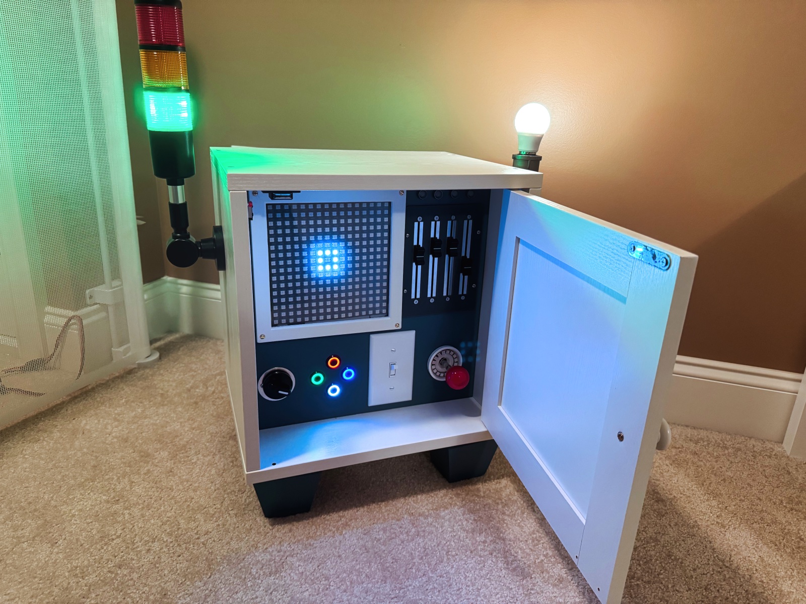
The parts are a smattering of favorite Adafruit products supplemented with random other parts (details below the break). Inputs and outputs are run through an RP2040 microcontroller development board programmed in CircuitPython, so as children get to an age where they might be interested in coding, the Wonderbox could be their first target.
Click through for more details and construction pictures.
 I’m currently working on a project that involves face tracking, and as a first prototype am using the built-in features in the
 ARKit library, Apple’s augmented reality API for iOS.
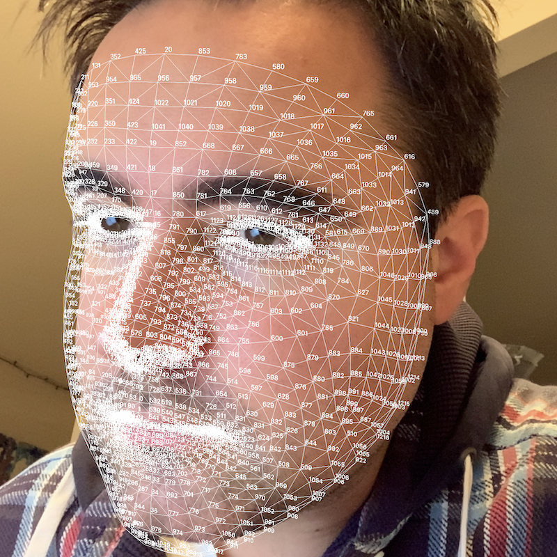
Using a device with a front-facing TrueDepth camera, an augmented reality session can be started to return quite a bit of information about faces it is tracking in an ARFaceAnchor object. One of these details is the face geometry itself, contained in the aptly named ARFaceGeometry object. For those who care about face shape landmarks, the 1220 individual vertices (points) can provide a wealth of information. However, there is little to no published information on which vertex corresponds to what point on the face.
While keeping in mind that this means these vertices could easily change in future versions of ARKit, I’ve taken the liberty of labeling points in case it is helpful for a future developer.
Update: A few people have asked how I generated this map. Details below.
Click on for more pictures and a little code…
 As anyone who has written a thesis will tell you: Like it or not, at some point in the writing process, you will spend far too much time tweaking a minor formatting issue. Thankfully, typesetting tools like LaTeX can minimize this headache by providing consistent, structured formatting.
LaTeX and similar tools follow a “what you see is what you mean” model, unlike Microsoft Word, which is “what you see is what you get”. When you’re starting a new section in a LaTeX document, you don’t click bold and increase the font size. Instead, you type \section, and the engine automatically assigns a section number and format, updates the table of contents, and even adds within-document links. This all sounds complicated, but if you’ve written HTML, you know the idea. (Word power-users will reply that Word has similar tricks up its sleeve. This is true, but LaTeX explicitly separates text from layout, preventing a lot of the “gremlins” that creep into Word documents.)
Of course, this paradigm creates a significant disconnect between the text you type and the beautiful PDF document that results. This is where a good template comes in. It defines everything from how the title page is laid out to what the page header looks like in the bibliography. For a LaTeX user (and anyone writing a document as long as a thesis should be), a good template is everything. I was lucky enough to find a template that Sam Evans adapted for social sciences use based on the original maths template by Keith Gillow. I wound up making my own modifications, and re-packaged the template for posterity.
Download the Oxford thesis template here.
If you prefer, you can also view on GitHub.
Click for a few of the template’s features.
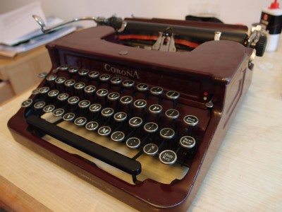 I’ve always had a soft spot for classic devices, and so Jack Zylkin’s USB Typewriter project was naturally intriguing. Jack has come up with a set of electronics that enables a typewriter to be used — nondestructively — as a USB keyboard. Sabine and I constructed one of these “wonders of obsolescence,” and then I wrote a little iPad app to take the best advantage of the device.
Read on for more if you’re so inclined.
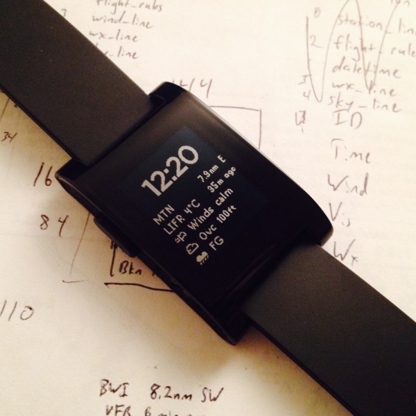 For Christmas, my brother gave me a Pebble smart watch. In addition to showing the time in a variety of ways, this little watch can connect to a smartphone over Bluetooth to show text messages and caller ID information. It also interfaces with a variety of sports tracking apps, including my favorite, iSmoothRun. The most exciting feature of the Pebble, though, is that it’s an open platform with a simple development kit for the C language and streamlined developer’s tools.
The holidays came in the midst of the Pebble SDK 2.0 release, which includes a JavaScript environment allowing watch apps to make use of the phone’s internet connection and GPS signal. One of the most popular applications of the Pebble-phone connection is to display the local weather in addition to the time. Partly as an exercise to learn the Pebble system and partly to create a handy way to check aviation weather, I wrote a watchface that displays the nearest METAR — a standardized aviation forecast — alongside the time.
The project involved a PHP backend, C watch app, JavaScript phone component, and — perhaps most surprisingly — becoming intimately acquainted with the Pebble font resource file format. The lion’s share of this post describes generating a custom font for Pebble; the rest gives an overview of the Metar watchface itself. Read on if you’re interested.
For a variety of technical reasons (more control over the domain, ability to run entirely custom PHP, potential future tech projects), I recently moved this blog from WordPress.com to its current home, a “self-hosted” WordPress installation on a Bluehost server. While the process was fairly straightforward and instructions are available, there are some “gotchas” with workarounds that bear explaining. This article gets fairly technical, so read on if you’re so inclined.
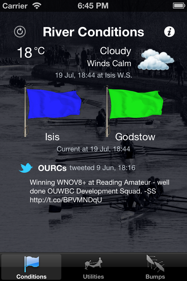 Every sport is a subculture, and rowing is no exception. Rowers the world over obsess over their erg scores and can wax eloquent on how to set the boat for hours. There’s even a Tumblr. But in Oxford collegiate rowing, the eccentricity is even more pronounced. We obsess over two things: the flag status, which tells us whether the river is rowable, and the bumps charts, which show each college’s history in the famous bumps races.
Originally, the flag was flown from a boathouse overlooking the river, and bumps charts were painted on boathouse walls and kept in notebooks. Over the past couple of decades, official and unofficial online versions appeared, and a rower’s morning ritual came to include checking the flag status online to determine whether they’re needed at the river. While this was certainly an improvement, there had to be a better way. Discussing this with Susan Graham, another Wolfson rower and Oxford engineering student, we realized we’d independently come to the same conclusion: what the Oxford collegiate rowing community needed was a mobile app.
Susan and I got to work. We founded Feather & Square, LLP and released OxBump for the iPhone. In time, we would release three other apps, add iPad compatibility, and develop a host of additional features. We partnered with a radio station, were featured by the Met Office and Information Aesthetics, and our apps pop up in pubs OxBridge-wide. A fuller accounting of the apps can be found on the F&S Products Page, but there are a few screenshots below if you’re interested.
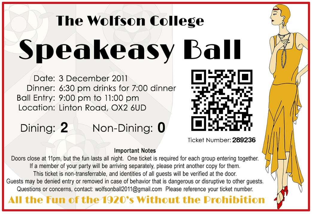 Lavish, college-sponsored balls make up an age-old component of the Oxford social tradition. The oldest, richest colleges take it in turns to hold the Commemoration ball each summer. Many others hold their smaller events in the spring, showing off their grounds in Oxford’s most seasonable weather. Wolfson takes a bit of a different approach, and throws an annual Winter ball. This avoids competition with other colleges’ events, and livens up the social scene during what can otherwise be a dull spot on the calendar.
One perennial challenge of these balls is a ticketing system. Because tickets are relatively expensive, and food and drink inside the event are included, ball organizers face a challenge preventing people trying to “crash” the ball. This has lead to a bit of a cat-and-mouse game between ball organizers and those who would rather not pay. After simple tickets were forged, intricate wristbands were distributed in advance. As material science students began to duplicate those, individually numbered tickets were given out in before the event and traded for wristbands on the night, with the tickets marked on a master list with each exchange. While this method proved effective, it was frustrating for the hundreds of ballgoers in the queue waiting for one master list to be consulted for every entry.
For Wolfson’s 2011 ball, I was asked to create a unified ticketing system that would allow ticket purchase and tracking as well as a parallelizable entry system on the night. I was able to come up with an online sales system that integrated with Google Spreadsheets for easy manual modifications. An integrated ticketing system allowed any worker at the door to turn their phone into an effective ticket scanner. Read on for the full details.
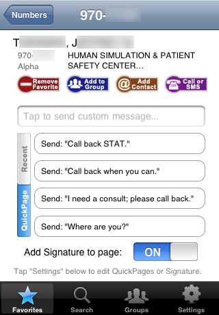 Towards the end of the first year of medical school, as we prepare to enter the hospital wards, Duke medical students are issued pagers. The Duke paging system is run by a large commercial vendor and can be accessed via phone, SMS, or a dedicated website. However, there is no smartphone app. Given the ubiquity of smartphones in the hospital and the frequency with which pages are sent “on the go,” I decided to use this project as an excuse to learn iOS programming.
Because the commercial system had no open data protocol built in, the DukePage app retrieved information and sent pages the same way humans did: by parsing the user website. This provided a bit of built-in security: information was only available when connected to the Duke network, and the app’s access was no greater than anybody with a web browser.
The app’s most crucial feature was its ability to parse the various types of pagers that could turn up in search results. Alphanumeric and numeric pagers were the norm, but the app could also follow the chain to reach the correct pager when one was “covered” by another, or dial outside numbers when a pager indicated that preference (common when a support person went home for the day). It would build page groups and favorite lists, and stored recently sent pages and a “page signature” with a callback number.
The first beta was released to a select group in June of 2009. By January, a feature-complete release candidate was in active use by about 20 testers throughout the hospital, and enjoying rave reviews. I was in discussions with the Duke IT staff and technology transfer office about “making it official”, either as an in-house project or working with the vendor. Unfortunately, around that time, the paging website interface was upgraded while my clinical responsibilities prevented me from adapting the code to the new system. Hopefully someday I’ll have the chance to revisit this project. In the meantime, click for some screenshots.
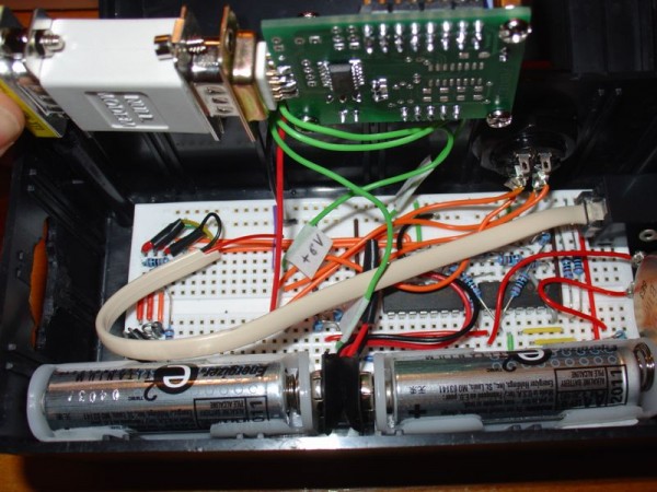
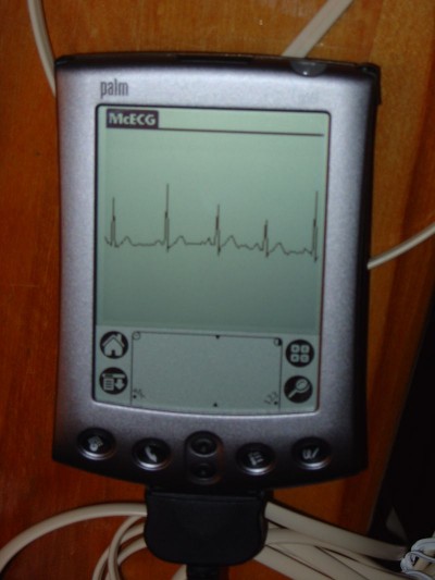
In my sophomore year at Penn State, I built an electrocardiograph out of a PalmPilot as a hobby project. The signal amplification circuit is derived directly from plans at Jason Nguyen’s page. My contribution was to add the analog-to-digital converter and program the PalmPilot interface (as well as putting it all in a nice little enclosure).
Click for more!


 I’m currently working on a project that involves face tracking, and as a first prototype am using the built-in features in the
  As anyone who has written a thesis will tell you: Like it or not, at some point in the writing process, you will spend far too much time tweaking a minor formatting issue. Thankfully, typesetting tools like
  I’ve always had a soft spot for classic devices, and so Jack Zylkin’s
 Every sport is a subculture, and rowing is no exception. Rowers the world over obsess over their
  Lavish, college-sponsored balls make up an age-old component of the Oxford social tradition. The oldest, richest colleges take it in turns to hold the
  Towards the end of the first year of medical school, as we prepare to enter the hospital wards, Duke medical students are issued pagers. The Duke paging system is run by a large commercial vendor and can be accessed via phone, SMS, or a dedicated website. However, there is no smartphone app. Given the ubiquity of smartphones in the hospital and the frequency with which pages are sent “on the go,” I decided to use this project as an excuse to learn iOS programming.